How to visualize event data in a way that we can analyze multiple process executions at once over time? This part introduces the “Performance Spectrum”, which is a way to map all traces in a classical event logs over time. Combined with visual analytics, the Performance Spectrum allows to analyze how multiple process executions form dynamics beyond a single case such as temporary workload changes, delays, batching and much more.
- Understanding the Performance Spectrum
- Tool Support for the Performance Spectrum
- Hands-on: Analyze the Performance Spectrum of the Road Traffic Fines Management Process
- Hands-On: Load and Concept Drift Analysis
- Patterns in the Performance Spectrum
- Exercise: Reading Patterns in the Performance Spectrum
- Case-Study: Performance Spectrum-based Analysis
- Reflection
Understanding the Performance Spectrum
Read this blog post to get a deeper understanding of the Performance Spectrum: Performance Spectrum for Analyzing Business Processes
Tool Support for the Performance Spectrum
The performance spectrum is implemented in multiple tools and platforms
- Standalone GUI tool: https://github.com/processmining-in-logistics/psm
- ProM plugin: https://www.promtools.org/
- As Python library for Jupyter notebooks: https://github.com/tomvmeer/PF4PY
- In PM4Py: https://pm4py.fit.fraunhofer.de/documentation#statistics
- As R library ‘psmineR’ of BupaR: https://bupar.net/2022/10/11/welcome-to-the-bupaverse/
Hands-on: Analyze the Performance Spectrum of the Road Traffic Fines Management Process
Install the Performance Spectrum tool of your choice (if you are in doubt, go with the ProM plugin for which we provide detailed steps)
- Download and install the latest ProM release from: http://www.promtools.org/doku.php?id=prom612
- Run the package manager (e.g.,
ProMPM612.bat/.sh) and install RunnerUpPackages and PerformanceSpectrum
Download the Road Traffic Fine Management Process event log from the 4tu data center
de Leoni, M. (Massimiliano); Mannhardt, Felix (2015): Road Traffic Fine Management Process. 4TU.ResearchData. Dataset. https://doi.org/10.4121/uuid:270fd440-1057-4fb9-89a9-b699b47990f5
Load the event log into the tool
- ProM: Import… (top-right corner) or drag&drop the file into the ProM window, in the dialog “Select an import plugin” choose ProM log files (XESLite – MapDB) or ProM log files (Naive) > OK
Pass the event log to the performance spectrum library/plugin
- ProM: select the event log > click on the Play button (circular button with “play” arrow on the right), in the Actions list select Performance Spectrum Miner > Start
- In the “Event Log Pre-Processing” dialog, choose as Bin size “30d” and note down or change the Intermediate Storage directory (for visualization, the Performance Spectrum transforms then stores the transformed data, you can later re-import the transformed data) > Process &open. This will take a moment.
- The Performance Spectrum window opens, click Open with default settings in the dialog.
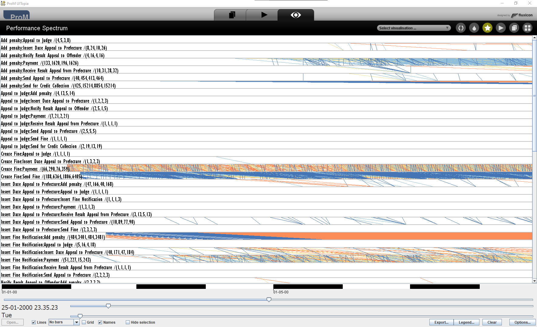
You will be greeted by an image similar to the one on the left. It shows a list of segments.
Each segment is the “space” between two subsequent activities in the process. In a process map, a segment is an edge from one activity to another activity.
The segments are ordered alphabetically (so not in the order of execution in the process) and all segments are shown – regardless of whether they are infrequent or frequent.
Familiarize yourself with the tool’s controls and parameters for filtering, see the manual for ProM.
Filter the segments to only show the most frequent segments which have at least 100 occurrences.
- In ProM: the Options… button in the bottom left, set Throughput the minimum (left box) to 100 > OK.
- Use the sliders to scale the visualization horizontally and vertically to obtain a first performance overview on the process.
This gives you an overview on the most frequently used parts of the process over time.
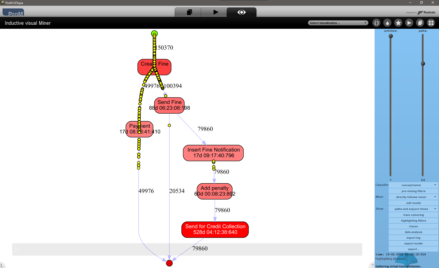
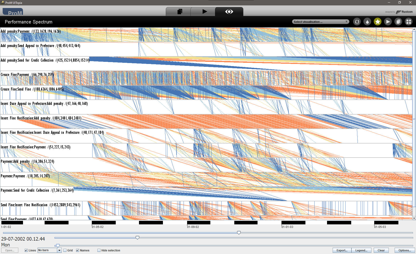
To order the segments in the Performance Spectrum not alphabetically but by their execution, open the log in a process map or process variant explorer.
Note down the order of segments of the process variant(s) you would like to analyze. For example from the process map on the left, we can extract.
Create Fine:Payment
Create Fine:Send Fine
Send Fine:Insert Fine Notification
Insert Fine Notification:Add penalty
Add penalty:Send for Credit Collection
Order the segments in the Performance Spectrum by this sequence of segments.
- In ProM: save the list of segments above in a file
sorting_order.txtin the Intermediate Storage directory you selected when loading the data into the Performance Spectrum (by default this is <your user directory>/PSM/perf_spec_<date>-<time>, e.g., C:\Users\<username>\PSM\perf_spec_2022-12-20_21-04-23
Reload the Performance Spectrum:
- In ProM: Import the file <your user directory>/PSM/perf_spec_<date>-<time>/session.psm
- Select the Performance Spectrum Directory object in the workspace > Run > Performance Spectrum Miner Viewer
- The ordered segments are now shown at the top, all other segments follow alphabetically below.
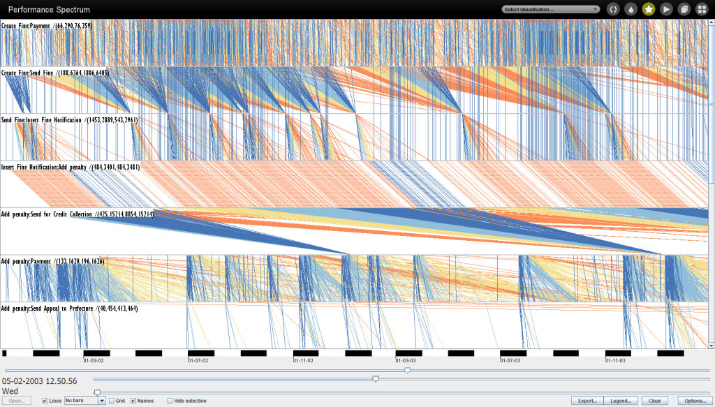
The lines passing through the ordered segments now show how all cases “flowed” through this trace variant over time and reveals patterns.
Exercise
- Which patterns can you identify?
- What is their meaning?
Hands-On: Load and Concept Drift Analysis
The Performance Spectrum is a fully detailed data structure and visualization of all cases over all segments over time.
There is a second visualization of the performance spectrum called the Aggregated Performance Spectrum. The idea is simple: define a bin size, for example of 1 day. This divides the entire timeline into a series of bins. Count how many lines cross each bin and visualize this aggregate as a bar chart.
Let’s explore this idea on the BPI Challenge 2017 event log.
- In ProM: import the BPI Challenge 2017 event log into ProM > Run > Performance Spectrum Miner > choose as Bin size: 1d > Process & Open
- Options > Filter on minimum throughput: 5

Change to the aggregate Performance Spectrum
- In ProM: In the bottom row, open the drop-down menu No bars and change the value to Intersections
The aggregated Performance Spectrum on the left shows that different parts of the process see a very different workload (pending cases) over time.
- Some segments are used constantly but with changes in performance (dark blue = fastest 25-percentile, orange = slowest 25-percentile).
- Other segments show varying degrees of load.
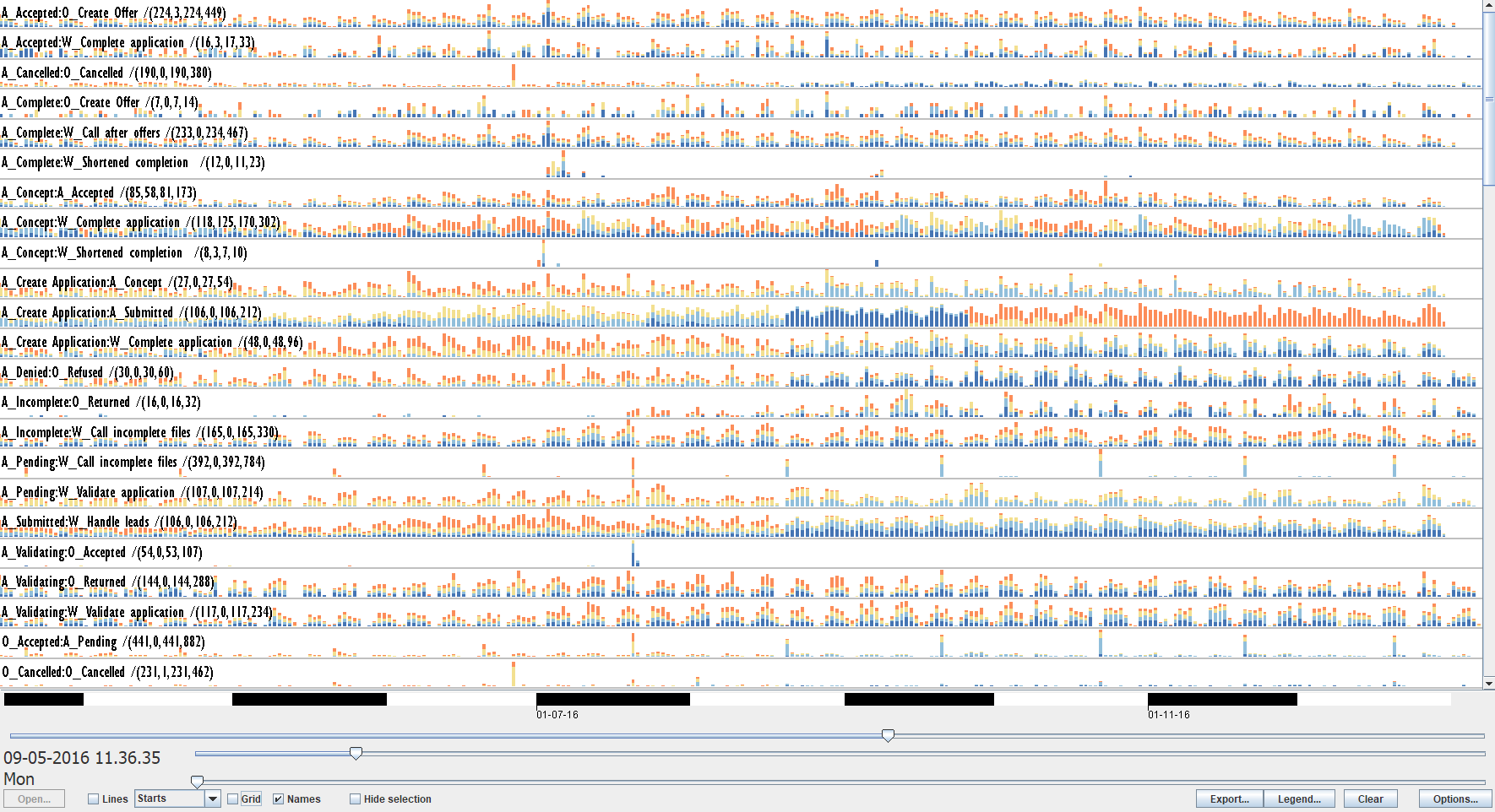
- In ProM: In the bottom row, open the drop-down menu No bars and change the value to Starts. Now the bins count how many cases entered the segment.
The aggregated Performance Spectrum on the left shows:
- Most segments see periodic behavior (weekly patterns) in the number of cases processed.
- But we see several clear performance changes in several segments (where the color of multiple segments changes together).
All these patterns together give insights into periodicity and concept drift in the performance of a process.
Patterns in the Performance Spectrum
The lines in the performance spectrum form a variety of patterns. The taxonomy on the left shows a number of different, independent characteristics by which these patterns can be combined.
The following paper provides more details on the taxonomy and how to apply it:
Vadim Denisov, Dirk Fahland, Wil M. P. van der Aalst: Unbiased, Fine-Grained Description of Processes Performance from Event Data. BPM 2018: 139-157

Exercise: Reading Patterns in the Performance Spectrum
Apply the Performance Spectrum on other event logs
- If you are a process mining professional: take event logs from your own work/projects and load them into the Performance Spectrum
- If you are a researcher/student: take any log from https://data.4tu.nl/search?q=real+life+event+logs
Tasks
- Explore the event logs for performance patterns, drifts, and changes.
- Compare the performance characteristics of different processes, especially
- compare: BPI Challenge 2012 and BPI Challenge 2017
- compare the event logs in: BPI Challenge 2015
Case-Study: Performance Spectrum-based Analysis
The event log of the BPI Challenge 2018 is a particularly challenging dataset. It spans 3 years and undergoes two process improvement steps that change the process performance characteristics significantly. The following report (open access) shows how to use the Performance Spectrum to analyze the changes to the process and their impact on the process performance.
Denisov, V. V., Belkina, E., & Fahland, D. (2018). BPIC’2018: Mining Concept Drift in Performance Spectra of Processes. (BPI Challenge 2018).
Reflection
Revisit the list of processes and analysis questions you noted down in Part 1 – What are Processes?. Which of these processes would you expect to show interesting characteristics in the Performance Spectrum? Which analysis questions can be answered with the Performance Spectrum? Would you now change the analysis questions given that you know what the Performance Spectrum is?
